Wednesday, December 12, 2012
Thursday, December 6, 2012
30 Second Video
This video's purpose was to get familiar with using the school's cameras, importing the video, and editing it in iMovie. I decided to leave the audio alone because I thought it was bizarre that instead of the peaceful sounds you would expect from a historic, scenic campus all you can hear is the sound of landscaping and construction. The subject matter was supposed to be our favorite space on campus, but since I don't have one I chose to film the Cater Walk because it is a walk that I take every day.
3-4 Minute Video
This is my 3-4 minute video assignment. I decided to focus on my pet goats as for my subject matter, and use the techniques that we learned about in our video classes in the Beck Lab. To that end, I focuses on editing the video to 'go along with' the music I chose. Certain points in the video correspond to movements in the music, which was very much intentionally done. I also learned a lot about audio editing so that I could keep certain background noises, like the sounds of their hooves and crunching leaves, but eliminating other noises like feedback from the camera and my sisters voice talking over the video.
I chose to focus on the goats because I love the look on people's faces when they come to visit for the first time and see them running around. We live in the suburbs, and from the street you would never expect that our backyard is home to these barn yard animals. Of course, it also helps that they are dwarfs (the smallest is the same size as my cat) and they beg for attention.
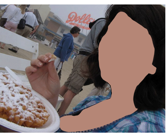
Monday, November 5, 2012
Animation Project
The theme of our animation project was transformation, which brought to my mind the last project we did where we had to create a vector image from a photograph and change it to say something about us. CLICK TO EMBIGGEN.
Tuesday, October 23, 2012
Illustrator Self Portrait

This is my final image for our Illustrator vector project. The self portrait photo I used was of myself at the beach. However, since the goal of the project was to somehow transform the image to reveal something about ourselves, I decided to create a background out of objects in Illustrator that was inspired by art nouveau images that I had seen online while I was looking for an object-building tutorial in Illustrator. I decided to juxtapose the natural imagery with the geometric shapes in the background because they both reveal something about myself- I love the natural, wild, unpredictable-ness of the outdoors but I am also a person who likes to keep my environment ordered to reduce chaos.
Tuesday, October 16, 2012
New Media Reflection
Today we had a speaker, Prof. Benjamin Bellas, show us examples of art using New Media. I especially like the pieces he showed us by Arcangel, particularly the one of the spliced videos of cats playing pianos to recreate an classical music. The way that the artist uses the medium to create a juxtaposition of new and old to make the 'new' versions seem ridiculous was a very successful concept. I also like the art exhibition with the hacked bowling video games that play themselves. I think that when you see the idea put in such a way, it makes it seem stupid to spend money on a video game to recreate an experience that you could easily have in real life. One thing that does strike me about the pieces where the artist recreated old paintings using video game technology, is that although the new medium made the paintings look absolutely ridiculous, there wasn't necessarily less skill involved in creating the new pieces. Creating physics engines, character skins, and all the other elements in the video game pieces must have taken hundreds of labor hours.
Wednesday, October 3, 2012
Visual Poetry Assignment
The purpose of our visual poetry assignment was to serve as an introduction to Adobe Illustrator. As I worked with the program, I became increasingly frustrated by the limited 'scope' that it was designed to work within. As a medium, I found Illustrator to be the inferior of Photoshop because it cannot work with images in the same way that Photoshop can. While I understand that the text component of the work was to be the focus, it was frustrating to be limited in that way when we were expected to create a work of art. I eventually strayed from the assignment, and finished my design in Photoshop. Here are two versions of my work in color, using a background photo of Windsor Castle that I took in spring 2005.

This is the second version, without the white highlight of the sword. I quite like this version better, but I wasn't sure if the sword could be clearly recognized, hence why I added the highlight in the upper version.


Or the inverse of this image, which looks something like this:


This is the second version, without the white highlight of the sword. I quite like this version better, but I wasn't sure if the sword could be clearly recognized, hence why I added the highlight in the upper version.

Staying within the scope of Illustrator, I lose the image entirely because it cannot be manipulated in conjunction with the sword in this program. No modification of either image can be done, except for some scaling up on the sword because it is a downloaded vector image. Since it is unrecognizable in this form, I do not feel that I went outside the scope of the assignment by including an outside image.


But, you see, by changing it to the white background and the black words I have been forced by the program to change the meaning of my piece. The point is for the sword to be missing from the picture- but I cannot work with the image in Illustrator so I cannot change it from black. And having it read as a black image on a white background makes the sword present in the image, and not missing.
So, I have four versions of this assignment and the ones that I modified in Photoshop are much closer to what I originally conceptualized while the two created solely in Illustrator fall short of what I wanted. Que sera, sera.
Thursday, September 20, 2012
I find visual poetry is harder for me to understand than other forms of art, I guess because I didn't react to it emotionally as immediately as our previous photoshop projects. The only piece she showed us that I reacted to was "The Omission Report" by Ronald Johnson, and I felt that he conveyed not only the horror of the event to which the report referred in its unaltered version but the absolute hopelessness of the situation they were in by intentionally leaving the only complete-sounding sentence in his work "Everything will be okay if you just stay quiet." The work actually reminded me of The Ticking is the Bomb author Nick Flynn who visited campus last semester. During his presentation, he showed works of his own that used the same style and subject as "The Omission Report", as well as showing us works by another artist who used the interactive digital poetry format that our guest speaking showed us at the end of her presentation. I guess the reason I don't react with strong emotions is that the format really is blurring the line between art and design- which is fine, the Pop Art movement has been around for decades. But I don't react emotionally to a Campbell's Soup can either.


Tuesday, September 18, 2012
Emilee's Texture Mapping Process

This is my Final Texture mapping project. I wanted to play with the concept of the natural being influenced by the manmade. To that end, I used the image of the hawk and overlaid it with images of metal studs, a gem, various knitted and woven items, and the texture of a napkin.
There were some effects that I wanted but was not able to find an item to scan. To avoid copyright issues, I chose open source images that are free to the public. I used two different background images that I merged, and neither of them are my original work. Another image that I borrowed was the gem used to create the hawks eye. However, I used seven different scanned textures of my own to transform the image.
Here is the original open source stock image:

Subscribe to:
Comments (Atom)